How I Redesigned Activation for One of Russia's Largest Brokers
BCS is one of the largest brokers in Russia. Its mobile investment
app provides access to stocks, funds, bonds, and other financial instruments.

My role
Senior product designer, responsible for the onboarding and activation stream
Industry
Fintech
About
BCS is one of the largest investment platforms in Russia. Users were dropping off before completing registration and never reaching their first trade. I redesigned the full activation funnel — registration, quiz, account opening, and first portfolio — cutting friction at every step.
Challenge
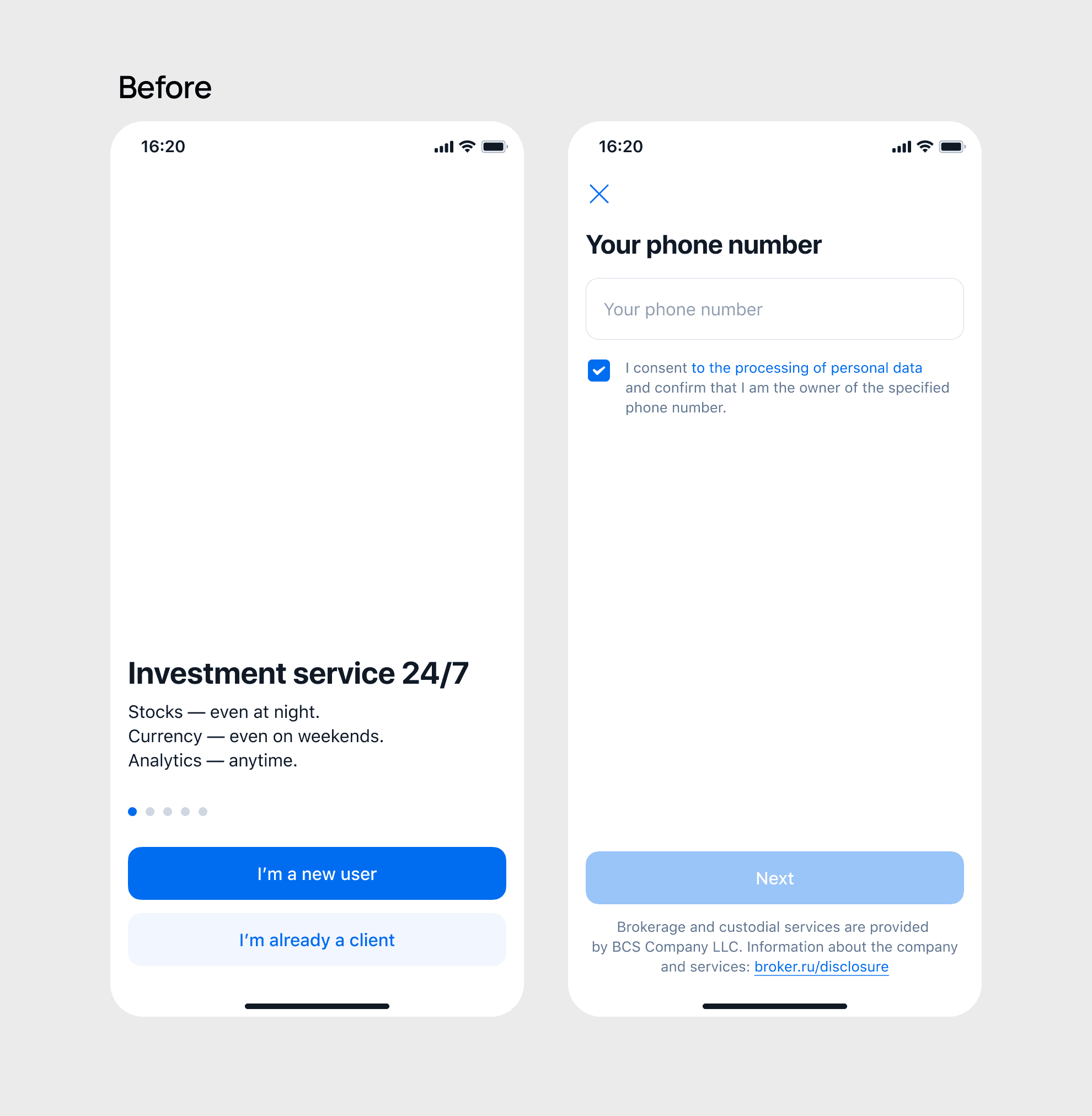
As many as 55% of users abandoned the flow between the welcome screen and the phone number entry step. My goal was to boost activation rate — the share of users reaching their first key screen — and improve retention after onboarding.
The original form asked for too much at once — name, phone, email, and password, all before the user had any reason to trust the app. I simplified the flow. I moved some fields to a later step, and I combined two screens into one. This removed one extra tap.


We tested this with 350 users. The results were not what we expected. 38% of users did not understand the assistant's tone. 30% said the chat was harder to read than a normal form.
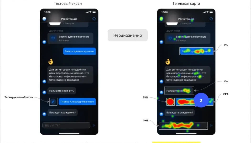



Based on this, I decided to go back to the form. But I kept the friendly, conversational style of the text from the chat version.

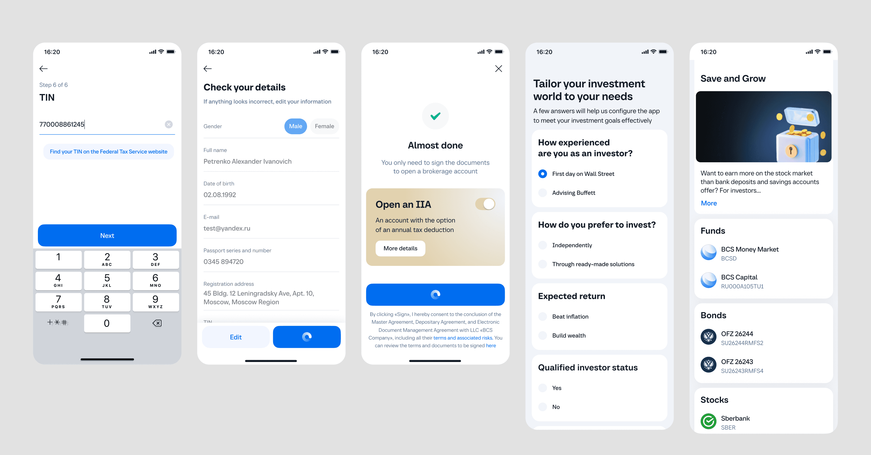
II. Quiz + Account Opening
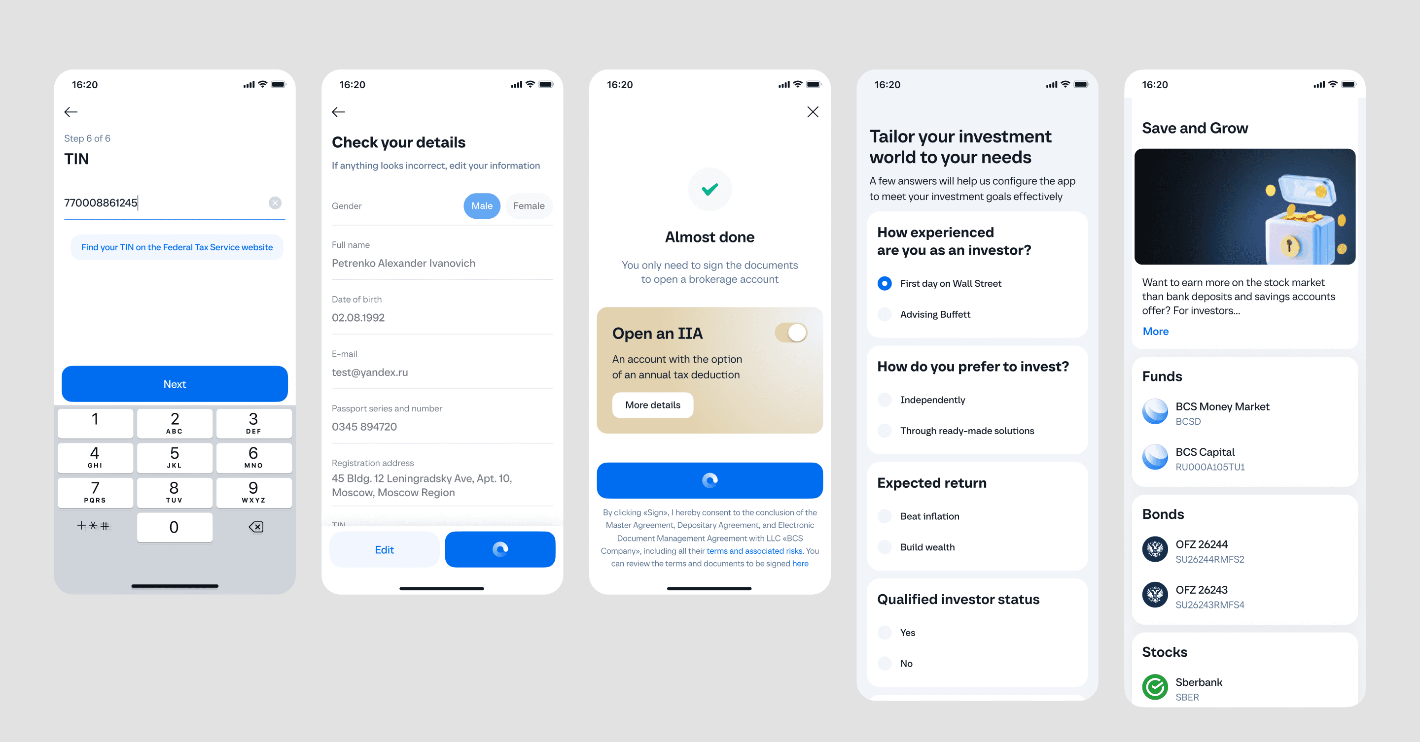


Next: The Account Opening (Waiting) Screen
Account verification took several minutes. Instead of a blank loading screen, I designed a waiting state that kept users active. They could turn on notifications, verify their identity, or check the FAQ while they waited.
After registration, account opening, and the quiz, users arrive at the app's main dashboard. At this stage, it was important to think carefully about what to show new users — and how to avoid making them feel overwhelmed
My Task: Designing the Onboarding Dashboard for New Users
The image below shows two versions. On the left is the original design, with equal visual weight for every block. On the right is my redesigned version, with a clearer visual hierarchy.
In the original version, users didn't know where to start or what action to take first. I redesigned the screen to fix this.
The "Where to Start" section is now at the top of the screen. It works as a clear entry point into the app's core features.
The welcome bonus is still visible, but it no longer competes with the main call to action. It adds value without pulling attention away from the main goal.
I added a new "Top First Purchases" section. This solves a common problem: new investors often don't know which products to choose first. By showing popular and frequently bought assets, I made it easier for users to make their first purchase.


Activation Landing Pages
In addition to the main dashboard, I designed activation landing pages — screens that guide users on how to start investing.
These pages needed to work for two different types of users:
Complete beginners — users with no prior investment knowledge
Experienced users — new to the app, but already familiar with investing
To solve this, I used my previous experience designing landing pages for tech startups and IT companies.
→ On the left: landing page for beginners
→ On the right: landing page for experienced investors

Collaboration with development team
After implementation, the development team delivered a build. I compared it against the original design mockup and documented any discrepancies, providing clear explanations and screenshots — showing exactly what was off and how it should look. After the team made the necessary adjustments, I conducted a follow‑up review to verify that all issues had been properly addressed.
Design System
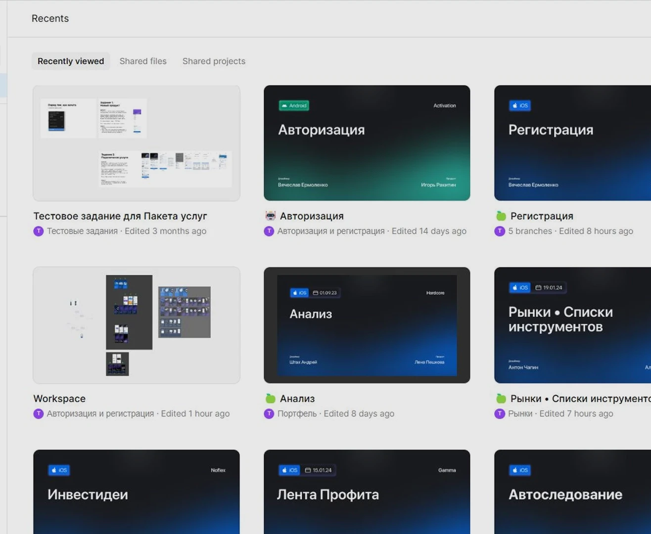
BCS has a large design system with separate files for iOS, Android, and Web. This means every scenario had to be implemented twice — in both light and dark themes, separately for each platform.
I worked with pre‑built components, reconfigured them for new scenarios, and, when necessary, coordinated with the design system team to approve new patterns.
→ Screen: Example of components from the BCS design system
What Changed for Users
The registration process is now shorter. I removed unnecessary steps and friction at the start.
User engagement grew by 20% — more users reached their first investment.
I designed activation landing pages and tested them with real users.
The landing page system can scale without help from developers.