Less Data Noise,
More User Retention
HydroPoint is an award-winning leader in smart water management solutions, dedicated to developing innovative and environmentally sustainable technologies.

Client
Hydropoint is US SaaS platform
Industry
SaaS
Team
Product specialist, data engeeneers
Users are Operations Managers at large retail and commercial chains — like Lowe's with 939 locations. Their job is to manage water costs across a huge portfolio without visiting each site.
My role: worked directly with the Director of UX, high level of autonomy, 5-month contract.
Big problem = money: users did not return after the first session, losing their subscription.
No design system → every screen from scratch, developers are slowing down.
Raising user retention
Updating design system
Refining the UI

User need this section to monitor multiple water consumption metrics across various locations — including availability, cost, and usage. All data types were displayed together, making it hard to focus on specific insights or compare between regions.
The insight: think like Google Maps
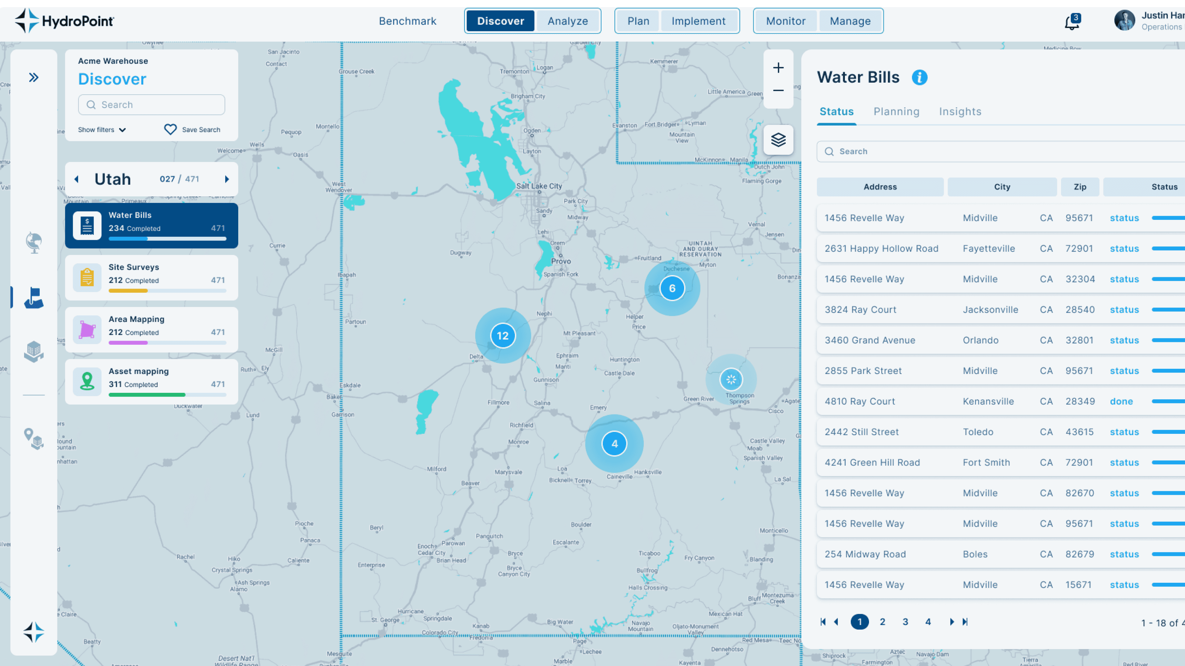
I introduced a layer-based map interface, where users can toggle between distinct data types, such as Water Bills, Site Surveys, Climate Data, Asset Mapping.
The main decision is to use layers instead of everything at once. Analogy: like in Google Maps where you switch between traffic, satellite, transport. Here: Water Bills / Site Surveys / Climate / Asset Mapping.

Additional impovements to get it right
ITo help users read the data more easily, I also refined several other details. For example, I addressed how the number of objects clustered at a single point was displayed, improved the infographics, and introduced color-coding for key elements. I also proposed displaying the important data for each layer directly on the map, within a collapsible panel — so users could access relevant information without cluttering the main view.
Complex data - finally readable

No design system → every screen from scratch, developers are slowing down.
One of the most important tasks in refining the UI and before adding new layouts was to streamline and improve the design system. There were a huge number of unused colors in the color palette, it was important to create a basic palette, auxiliary colors, and accent colors.
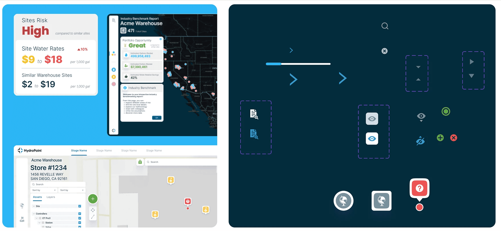
After improvements

The interface became more convenient, development was streamlined thanks to the new design system, and the overall UI quality improved.
